With the inks, color can be "wiped" on or "blotted" on. Try out the inks a few ways to see which look you like the best. For colorizing the entire monogram, I found the wiping method did the trick.
| This photo is from the Creative Memories blog that inspired the lesson. |
I created pink-ish letters by using the BARN RED chalking ink on white monograms. I then arranged the letters LOVE in the pattern of the LOVE park sign in Philly - iconic to my neck of the woods. I mounted my LOVE design on fall themed paper and will use it on a page about loving the fall weather in Philly.

I figured if it was possible to ink the monogram letters, why not the regular sized ABCs. Well, it worked, but it was very hard not to get ink on letters I didn't intend to ink.
So, I tried another tactic. In my sample above, I used an older set of ivory colored ABCs with the Olive Green chalking ink. I liked the patina it gave.
Here's my solution - tried it and it worked. Remove the ABC letters that you wish to use in your word or title. Stick them to a sheet of wax paper. Ink them, remove them and use them on your page. Now you can ink any size or color of ABC and give it a new look.
Continuing on, I experimented with making some stripey letters using all three chalking inks and that effect was pretty cool too.
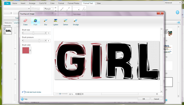
Of course, my digital customers wanted to earn a prize ticket for completing lesson #3 as well, so I took advantage of this time to teach them about the paint and darken tools in Storybook Creator.
Here are some screen shots of painting and darkening letters in SBC 4.0 (font is AR DARLING):

I showed my customers how to paint on the edge of a flattened text word. I taught them the difference between paint, darken and lighten. I also showed them how to change their brush size and what the scroll bar for brush pressure could do. I then challenged them to "ink" their own digital letters using one of these techniques on a page.
If you want a more in-depth lesson on using this feature, watch the P2P video by Tameka. If you aren't a P2P (Pixels2Pages) member and you like cM's digital products, you are seriously missing out - I'd suggest that you join. The video was taught back in April I believe. You cannot share videos with any customer who is not a member, and you cannot earn profit when you customer becomes a member, but having customers who love and use cM's software and giving them a source to learn new things about it is ALWAYS a good thing!
Stay tuned, in Lesson #6, I show how to use these SAME chalking inks to distress embellishments.
Happy Croptober Scrapping - Sher


I continue to be amazed at your creativity & teaching all of us (customers plus us non-creative cmc's) how to use CM's products in fun & inspiring ways!!! Thank you! Kathy B.
ReplyDelete