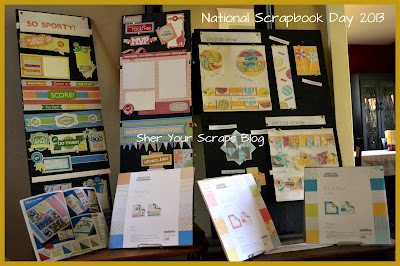
A sloppy square border is a great way to highlight all of the papers in a coordinating pack. In the examples shown, the border is embellished with Summer Title stickers and Spring Dual Layer stickers.
Let's get started:
Voila - done! How was that for fast and easy?
Here are some views of the borders shown in the Simplify Squares series:
And here is a product plug for the It's a Boy and It's a Girl Stack Packs. I LOVE them! I don't have any babies anymore, but the paper in these packs is so so cute, I just had to buy it. I gave away the two pages of die cuts that came with these stack packs at my NSD event. The die cut pages went to the two attendees with the youngest boy and girl at home (congratulations Beth and Marisa!).
And here's the other bonus, the papers in the boy and girl stack packs coordinate REALLY well with the color palette in the seasons paper pack. Awesome. Love it. Enjoy.
Still looking for more lessons. Well, no worries, I'll keep 'em coming. The next lesson features the Bordermaker notebook cartridge - it's part 1 in a 2-part "thinking outside the box" series that I showed at my NSD 2013 event. Stay Tuned.
Happy Scrapping. (And one last photo of all of the designs I've showed you so far).


No comments:
Post a Comment